When developing Android applications, user interfaces play a pivotal role in creating an engaging and interactive experience.
Circular progress indicators with percentages are an excellent way to visually represent the progress of tasks or actions.
Understanding the Basics
Let’s delve into the fundamental concepts underlying circular progress indicators with percentages in Android.
Circular Progress Bar
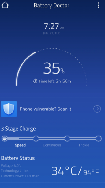
A circular progress bar is a graphical element used in Android app interfaces to display the progress of the current task.
Unlike typical linear progress bars that move from left to right, circular ones are visually appealing and often more intuitive for users. They represent progress in a circular fashion, which can be aesthetically pleasing and space-efficient.
Key attributes of a circular progress bar include:
- Outer Circle (Track): This is the outermost ring or circle that serves as the background or track. It provides a frame for the progress indicator and often has a fixed appearance;
- Inner Circular Segment (Fill): The inner part that animates and fills up as the task progresses. It visually represents the task’s completion status, with the filled portion indicating how much of the task has been completed;
- Progress Value: This is a numerical value that defines the current progress of the task. It ranges from 0 (no progress) to 100 (completion). You can dynamically update this value to reflect task progress;
- Maximum Value: Specifies the upper limit, usually set to 100. When the progress reaches this maximum value, the task is considered complete;
- Progress Animation: Often includes smooth animations to make updates visually appealing. These animations can be controlled to create a sense of smooth forward motion.
Percentage Indicator
A percentage indicator is a textual representation of the progress value. It displays the degree of task completion in percentages, making it easy for users to understand how much of the task has been completed.
The percentage indicator is typically located at the center of the progress bar or adjacent to it for easy visibility.
Key characteristics of a percentage indicator include:
- Text Display: It usually shows the value as a percentage, e.g., “50%,” when the progress is halfway;
- Font Size and Color: Text size and color are often customizable to ensure clarity and alignment with the app’s design aesthetics;
- Dynamic Updates: The percentage indicator should update in real time as the progress value changes. This allows users to receive timely information about task progress.
Circular progress bars with percentage indicators are widely used in various Android applications, such as file download managers, fitness tracking apps, and multimedia players, to provide clear and informative progress tracking.
Understanding these core components and principles will enable you to create visually appealing and user-friendly circular progress indicators with percentage displays in your applications, enhancing overall user comfort.
Setting Up Your Android Project
Now, let’s proceed with the implementation. We will use XML layout files and Java/Kotlin code to create a circular progress bar with a dynamic percentage.
Step 1: Designing the Layout
Start by defining the XML layout, which serves as the visual representation of the progress indicator.
<!-- circular_progress_bar.xml -->
<RelativeLayout xmlns:android="http://schemas.android.com/apk/res/android"
    android:layout_width="match_parent"
    android:layout_height="match_parent">

    <ProgressBar
        android:id="@+id/circularProgressBar"
        style="?android:attr/progressBarStyleHorizontal"
        android:layout_width="200dp"
        android:layout_height="200dp"
        android:layout_centerInParent="true"
        android:progress="50"
        android:max="100"
        android:indeterminate="false"
        android:progressDrawable="@drawable/circular_progress_drawable" />

    <TextView
        android:id="@+id/percentageTextView"
        android:layout_width="wrap_content"
        android:layout_height="wrap_content"
        android:layout_centerInParent="true"
        android:text="50%"
        android:textSize="24sp"
        android:textColor="@android:color/black" />
</RelativeLayout>


